
The first token-based design system used across HPI’s products, built while the design team grew from one to four.
Company
Hoang Phuc International (HPI), continued at ScaleUP
Role
Built the system. UX/UI Designer at HPI, then Product Designer at ScaleUP
Year
2022 to 2023
Platforms
Web, mobile and in-store devices
Scope
Three token tiers, foundations, 30+ component families, layer levels, documentation in the library
Tools
Figma, Tokens Studio, tokens released as a JSON set
Status
First beta near the end of my time at HPI, then upgraded and used at ScaleUP
Context
I joined Hoang Phuc International in December 2021 as a founding member of its Product Design team. Design covered 8+ products across HPI’s omni-channel ecosystem: consumer e-commerce and loyalty, in-store operations, and core enterprise tools for orders, inventory, HR and pricing. HPI had no token-based design system yet. I built Asgard as the first one, so every product, and every designer who joined after me, would start from the same foundations.
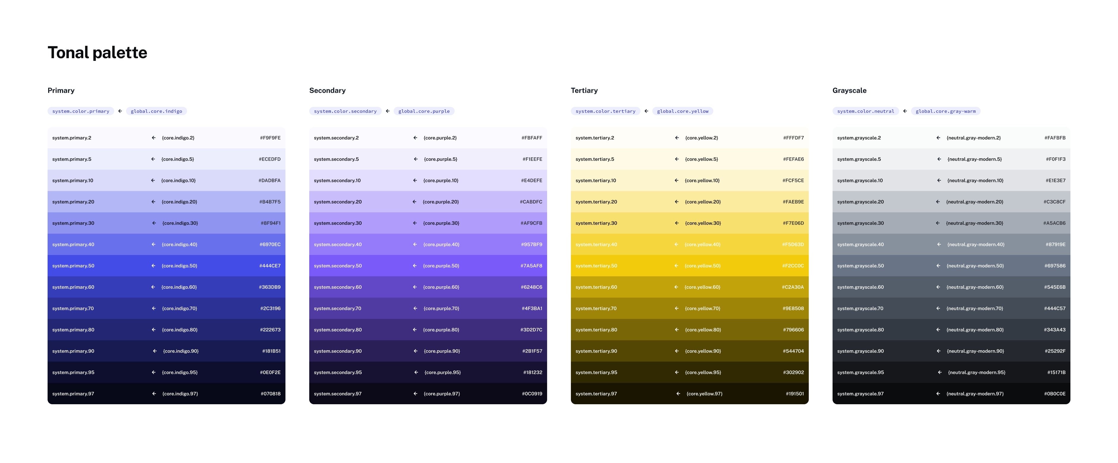
System color tokens. Each role points to a global ramp, such as system.primary to global.core.indigo.
My role
I set up the token tiers, the foundations and the component families, and wrote the guidance inside the library. Alongside the system, I co-built the Product Design practice from one designer to four: hiring standards, onboarding and design culture.
The first beta came out near the end of my time at HPI. In 2023 the project continued at ScaleUP, where I upgraded it and used it across a core platform and partner deployments, including white-label re-skinning.
Constraints
Constraint
What it meant
8+ products in three groups
Consumer apps, in-store tools and enterprise systems had to share one base.
A team growing from one to four
New designers had to learn the system from the library itself.
Light and dark
Every color role needed a value in both modes.
Web, mobile and in-store devices
The same tokens had to hold on desktop, phones and store hardware.
Decision
Global tokens hold the raw values every product shares, such as an indigo ramp from 2 to 97 and the feedback colors. Each domain is one platform, such as the e-commerce website, the operations system or an internal tool, and maps those values to its own color roles. Custom tokens cover what a single screen or feature needs beyond its domain, such as a one-off color or a colorblind-safe palette, without editing the shared tiers. A new platform becomes a new domain on the same global values.
core.indigo 2 to 97 · feedbackEach domain is one platform. A new platform becomes a new domain on the same global values.
Decision
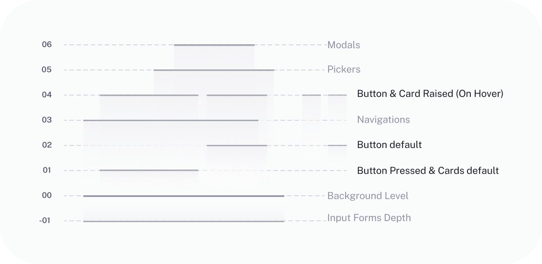
Asgard ties every shadow to a layer level, from −01 to 06, and each level lists the components that sit on it. A focused input sits at −01 and the background at 00. Cards and pressed buttons sit at 01, navigation at 03, raised cards and dropdown menus at 04, pickers at 05 and modals at 06. A designer picks the level from the component in front of them, and the shadow comes with it.
Decision
As the team grew, the people using Asgard were no longer only me. Every page opens with the same annotation card: what the part is for, how to use it, and links to the Figma, Tokens Studio and Notion guides. Tokens live in Tokens Studio and are released as one JSON set, so design and development read from the same source.
In practice
Passport is HPI’s single sign-in and access gate. Staff sign in once with their work account, then open the apps their role allows, such as Click and OMS. Admins manage staff accounts and app permissions in the same place. I designed it for desktop and mobile web while Asgard was still being built, so Passport works as a brand variant of Asgard: the same layer levels and foundations, in HPI’s yellow and black.
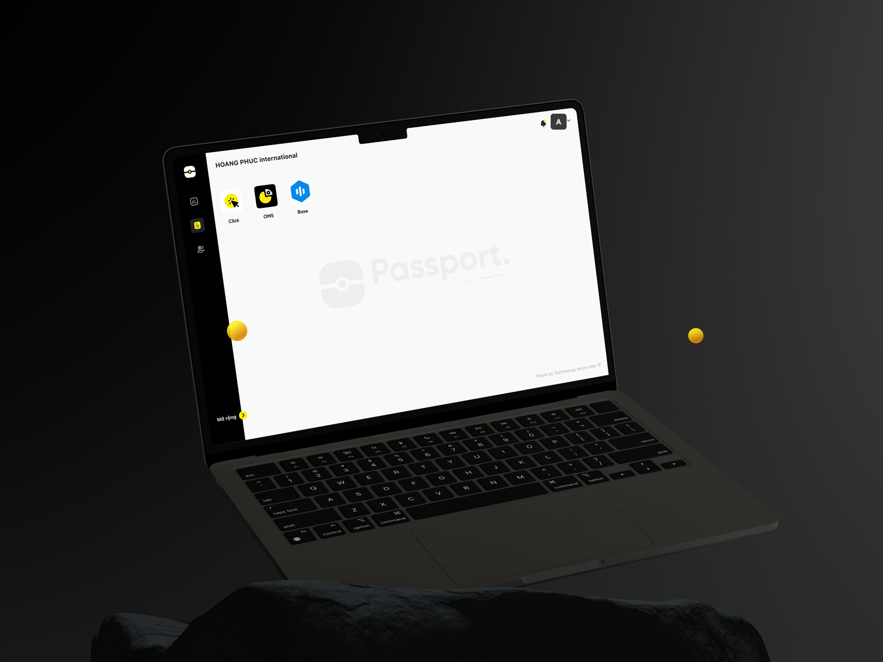
Passport home: the apps a staff member can open.
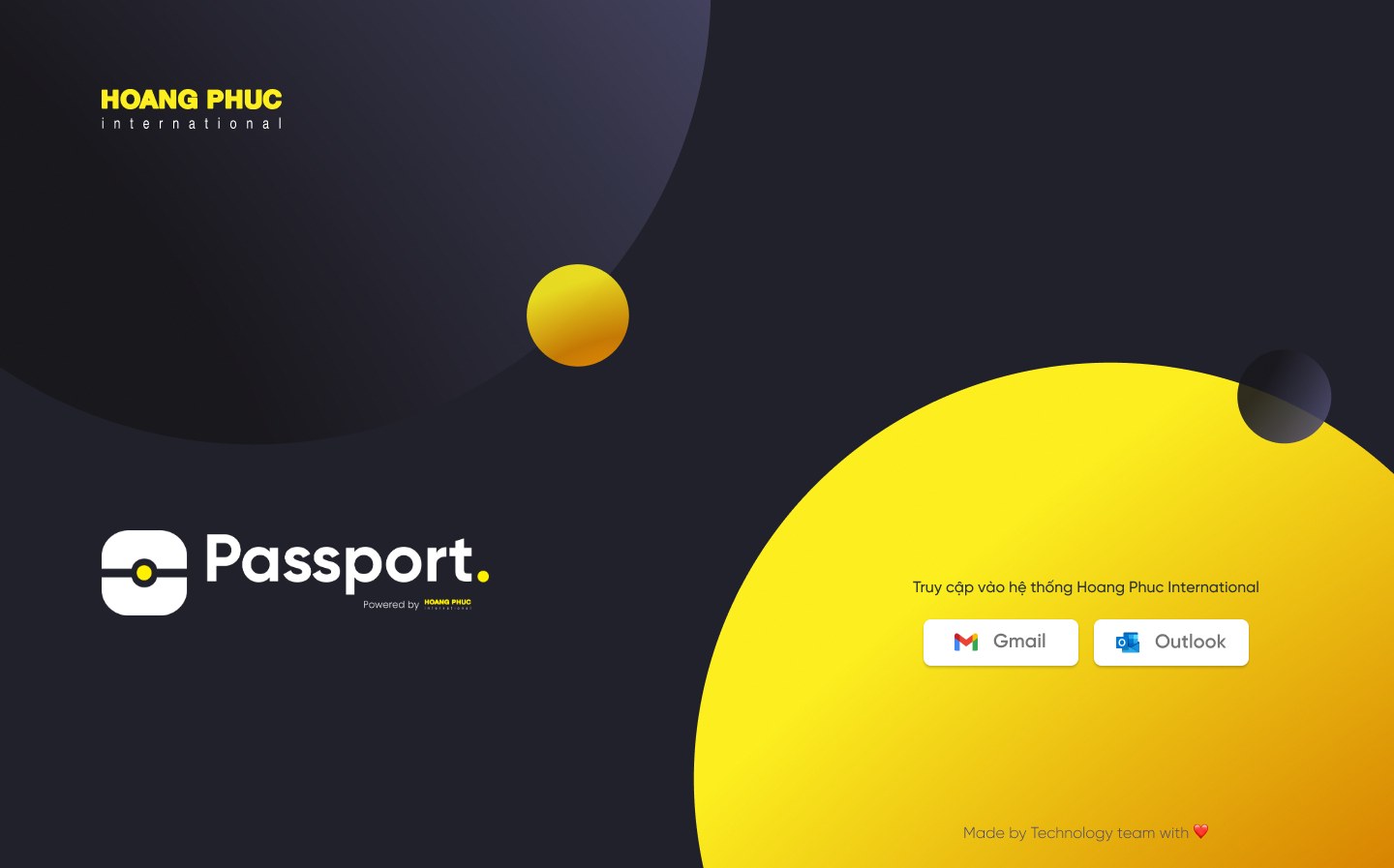
Sign-in with a work Gmail or Outlook account.
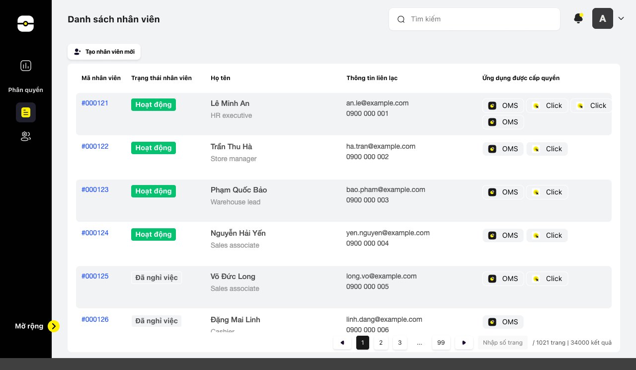
Staff list and app permissions. Names and contact details are sample data.
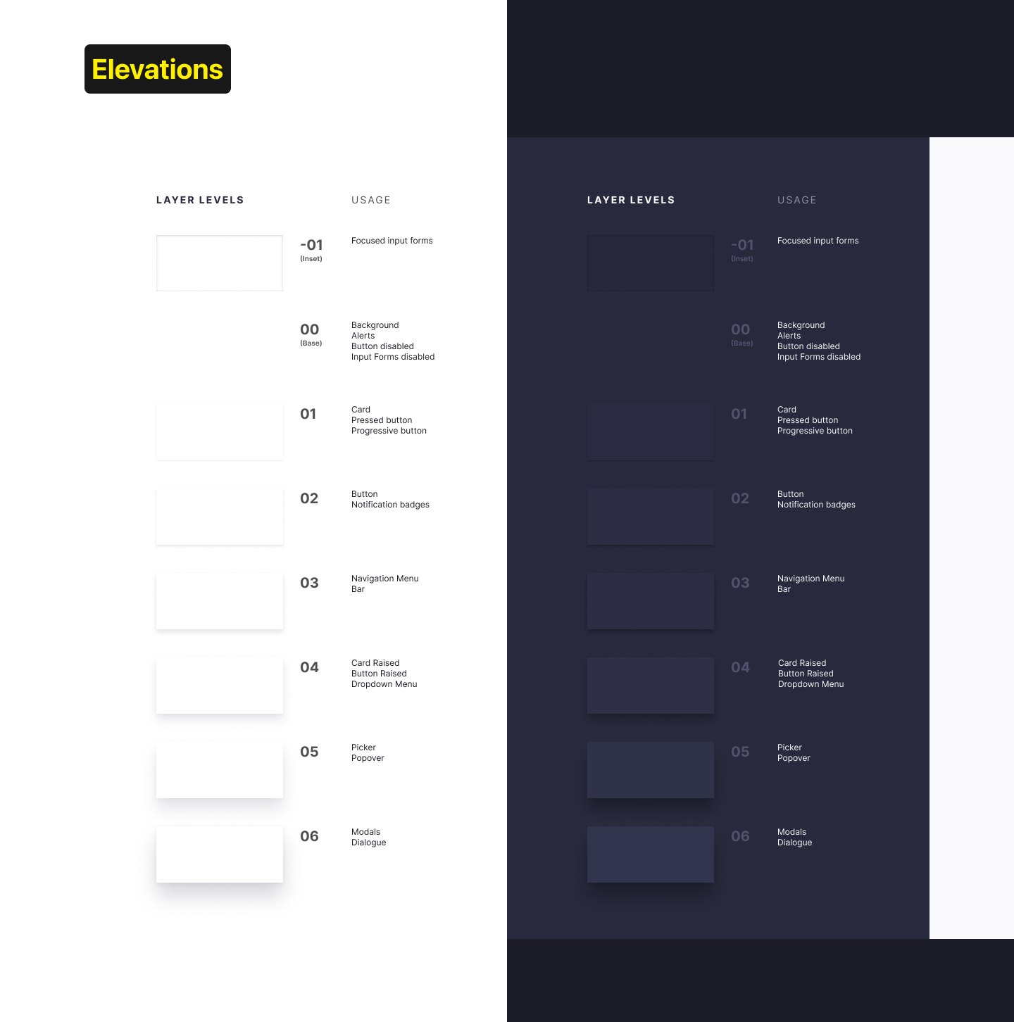
Layer levels in Passport, light and dark.
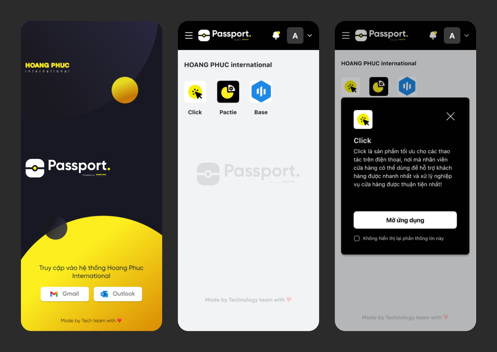
Passport on mobile web.
Outcome
Asgard became the first token-based design system used across HPI’s products and set the long-term design standard for its digital products.
The Product Design team grew from one designer to four on the same library.
After HPI, the system was upgraded and kept in use at ScaleUP.
Global, Domain and Custom.
From buttons and inputs to navigation and data display.
The Product Design team at HPI, from its first designer to four.
Consumer, in-store and enterprise products at HPI.
Figures from my time at HPI, 2021 to 2023.
Recommendation
Thuan Tran
Acting Head of Enterprise Digital Solutions, OCB. Managed Hieu directly at HPI and ScaleUP
What I learned
Asgard was my first time applying design tokens. I had no earlier documentation or reference to start from, and tokens in design were still loosely defined. The work was experimental: I tried a structure, found where it broke, fixed it, and did that again many times. Each new way of organizing and trimming the tokens went into the next version, so later releases inherited a better base. The team applied it successfully and kept improving it from release to release.
I led design across Druce’s property apps, turning UK lettings, sales and compliance rules into everyday mobile flows.